|
|
|
“Beauty is
in the Eye of the Beholder” |
|
|
GRAPHICS
AND
DESIGN |
|
|
TJI as a reputation for having an “eye for the
esthetic.” Our graphic designs, both print and Internet, have provided clients
with distinctive brand identification. TJI puts in the extra effort to make each
graphic design distinction, and in keeping with the image of the client. We do
not do “boiler plate” or “off–the-shelf” work. By clicking on the links below,
you can see the work of TJI for very different types of users. The range from
the civic tone of the
Public Policy Caucuses and the Illinois Committee for
Honest Government to the whimsical style of
acrapulate.com. – or the chic
elegant imagery of Maynard, Inc.
|
|
|
WEBSITES
CREATED BY THOMAS AND JOYCE, INC. |
|
|
Both in function and form, website should
provide "instant impression" that reveals the purpose and style of the
Internet service. For this reason TJI produces truly distinctive
sites. We
specialize in simple websites that clients can update themselves, with modest
training and without the need to hire highly technical experts. In addition, TJI
can generally produce a website or graphic treatment at a fraction of market
rates.
Acrapulate.com
 From the onset, TJI recognized
that this was a “silly site,” with great emphasis on the self-effacing
character of users. It is fill with whimsy and entertaining features.
Every thing on the site, including the cartoons, were custom created for
the site. From the onset, TJI recognized
that this was a “silly site,” with great emphasis on the self-effacing
character of users. It is fill with whimsy and entertaining features.
Every thing on the site, including the cartoons, were custom created for
the site.
(click here to visit the Acrapulate site)
Harbin
Business Exchange
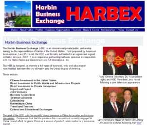 The Harbin Business Exchange (www.harbex.org)
is a site designed to promote China’s northernmost major city. It is a
region of China that was little known to the western world – and usually
thought of as a remote and desolate place. The purpose of the site was
to introduce the beauty and benefits of Harbin primarily to the business
community, but also in terms of culture and tourism. The site was
designed to serve many purposes. The banner portrays the dynamic vision
of the city. Chinese culture is reflected in the dominant use of red.
The site is designed to provide a great deal of information and still
remain user friendly. Through “events,” visitors can follow the
chronology of trade missions to Harbin and delegations visiting the
United States. In another section is the summary of the latest business
opportunities. Those interested in tourism can visit the spectacular
International Snow and Ice Festival. The Harbin Business Exchange (www.harbex.org)
is a site designed to promote China’s northernmost major city. It is a
region of China that was little known to the western world – and usually
thought of as a remote and desolate place. The purpose of the site was
to introduce the beauty and benefits of Harbin primarily to the business
community, but also in terms of culture and tourism. The site was
designed to serve many purposes. The banner portrays the dynamic vision
of the city. Chinese culture is reflected in the dominant use of red.
The site is designed to provide a great deal of information and still
remain user friendly. Through “events,” visitors can follow the
chronology of trade missions to Harbin and delegations visiting the
United States. In another section is the summary of the latest business
opportunities. Those interested in tourism can visit the spectacular
International Snow and Ice Festival.
Illinois Committee for Honest
Government
Like the PPC, the imagery of the ICHG is a mix of patriotic and civic activism. Here, TJI capture the
more grassroots approach, and the focus on government reform as a
principle objective.
Maynard,
Inc.
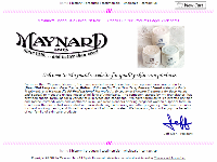 In introducing Maynard line of
cosmetics on the Internet, the objective was to give a strong
traditional image, in keeping with the company’s long history, while
providing an easy to read “airy” format. The distinctive pastel and
light color treatment present a hygienic impression, yet are distinctive
in the hues. In introducing Maynard line of
cosmetics on the Internet, the objective was to give a strong
traditional image, in keeping with the company’s long history, while
providing an easy to read “airy” format. The distinctive pastel and
light color treatment present a hygienic impression, yet are distinctive
in the hues.
(click here to visit the Maynard website)
Public Policy Caucuses
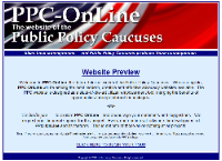 The graphics for this page were
designed to present a very strong patriotic imagery without resorting to
typical iconic downloaded images. The stylized “flag” offers the civic
imagery with out belaboring the point. Since this is a civic activist
cite, the challenge was to enable users to take advantage of the sites
many features without confusion. Both in written copy and site
functionality, the PPC site provides maximum efficiency with eye
pleasing imagery. The graphics for this page were
designed to present a very strong patriotic imagery without resorting to
typical iconic downloaded images. The stylized “flag” offers the civic
imagery with out belaboring the point. Since this is a civic activist
cite, the challenge was to enable users to take advantage of the sites
many features without confusion. Both in written copy and site
functionality, the PPC site provides maximum efficiency with eye
pleasing imagery.
(click here to visit the
Public Policy Caucuses website)
Our own, of course …
Thomas and Joyce, Inc.
Our desire was a clean and simple, easy-to-use site that did not fall
into the trap of cliché business images.
|
|
|
GRAPHICS
AND LOGOS |
|
| |
TJI believes that graphics are
powerful elements in communication. The are more than a pretty design.
Graphics and logos should reflect the image and purpose of the client. The
best logos are those that convey their message without the need of prior
knowledge or extensive explanation. If the target market does not “get it”
instantly … consciously or subconsciously … the graphic is not doing its
job.
|
|
| |
Best Friend Products/Dog Gone Bag |
|
| |
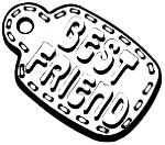
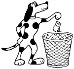 In branding a start up company around a new dog waste disposal product,
TJI created the name of the company as Best Friend Products, Inc., and
designed the dog tag logo in environmental green. In branding a start up company around a new dog waste disposal product,
TJI created the name of the company as Best Friend Products, Inc., and
designed the dog tag logo in environmental green.
 TJI
also created the name and the graphics for the product itself, the Dog-Gone
Bag. The cartoon dog was created to give the product a whimsical image. In
conjunction with the name of the product, the intent was to create a “say it
all” graphic. The cartoon dog and the title provide instant eye recognition
as to the use of the product. It was entire treatment was to convey the use
without allusions to the distasteful side of the products use. TJI
also created the name and the graphics for the product itself, the Dog-Gone
Bag. The cartoon dog was created to give the product a whimsical image. In
conjunction with the name of the product, the intent was to create a “say it
all” graphic. The cartoon dog and the title provide instant eye recognition
as to the use of the product. It was entire treatment was to convey the use
without allusions to the distasteful side of the products use.
|
|
| |
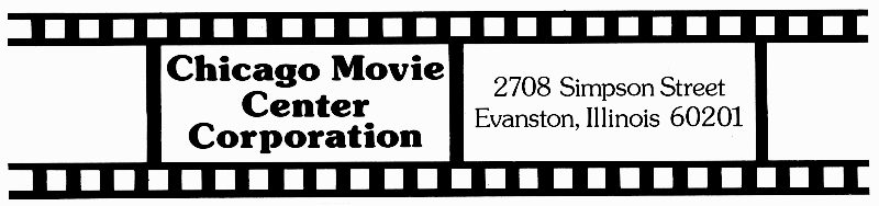
Chicago Movie Center Corporation |
|
| |
In another start-up situation, TJI opted for the most basic movie
iconography – the film strip. Each
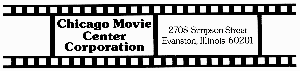 frame
provides an idea space for text and graphic that can be changed for various
uses. It allows the logo great utility and flexibility for letterhead,
brochures and animated uses. The use of open frames at each end gives a
sense of no beginning … no ending. frame
provides an idea space for text and graphic that can be changed for various
uses. It allows the logo great utility and flexibility for letterhead,
brochures and animated uses. The use of open frames at each end gives a
sense of no beginning … no ending.
|
|
| |
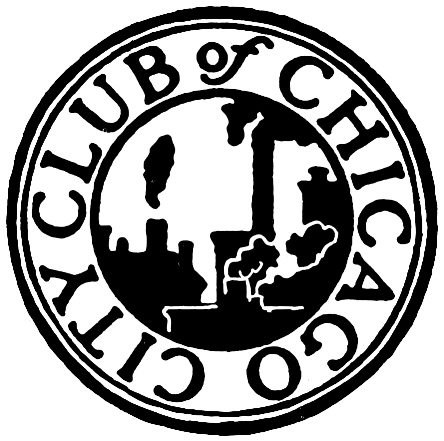
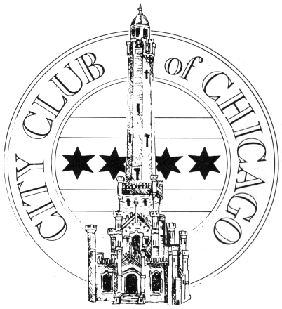
City Club of
Chicago |
|
| |
 The City Club of Chicago was founded in 1903, and its original logo
emphasized the imagery of the times, focusing on influence of development,
transportation and industry in bold back silhouette. In more modern times,
the touted imagery appeared negative, seeming to depict pollutions and
substandard housing. In 1976, the City Club adopted a design created by then
Executive Director Larry Horist, The City Club of Chicago was founded in 1903, and its original logo
emphasized the imagery of the times, focusing on influence of development,
transportation and industry in bold back silhouette. In more modern times,
the touted imagery appeared negative, seeming to depict pollutions and
substandard housing. In 1976, the City Club adopted a design created by then
Executive Director Larry Horist,
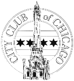 now president of TJI. The new design used
serif type face to convey tradition, but used an open format to give the new
logo a clean lightness. The vague imagery of the original was replaced with
the highly distinctive image of the iconic Water Tower. As a major survivor
of the Great Chicago Fire of 1871, the Water Tower boldly breaks through the
medallion borders to show strength and determination. The distinctive
six-pointed stars and internal stripes represent the Chicago flag. now president of TJI. The new design used
serif type face to convey tradition, but used an open format to give the new
logo a clean lightness. The vague imagery of the original was replaced with
the highly distinctive image of the iconic Water Tower. As a major survivor
of the Great Chicago Fire of 1871, the Water Tower boldly breaks through the
medallion borders to show strength and determination. The distinctive
six-pointed stars and internal stripes represent the Chicago flag.
|
|
| |
City Club of Chicago – Brochure |
|
| |
In order to depart from the stodgy format of many civic organization and
association brochures, TJI created a cartoon format featuring a typical
luncheon scene. This made the City Club an attention grabber, standing out
on tables and display racks at seminars, conventions, and display locations.
The imagery showed a happy and diverse membership. The cartoon “balloons”
were then employed to make certain relevant statements about the City Club.
In a doff of the cap to a bit if insider whimsy, the character at the podium
was a real caricature of long-time City Club President Thomas Roeser. The
overall humorous approach portrayed the Club as a fun organization –
essentially softening the hard edge of civic reform that was the backbone of
the City Club. 
|
|
| |
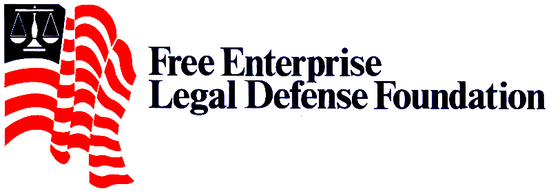
Free Enterprise Legal Defense Foundation |
|
| |
The
scales of justice cropped up again in an unrelated design. A start-up legal
defense public interest group need a new logo.
 Here TJI developed a very
simple stylized flag with a scale of justice replacing the field of stars,
creating an instant melding of patriotic imagery and the legal profession. Here TJI developed a very
simple stylized flag with a scale of justice replacing the field of stars,
creating an instant melding of patriotic imagery and the legal profession.
|
|
| |
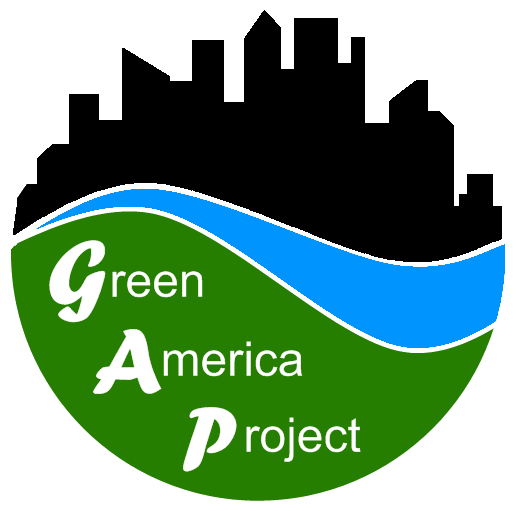
Green
America Project |
|
|
 Green America Project (GAP) is a new
environmental interest group designed to bridge the “gap” between
environmental activists and the corporate community. The basic design
features a stylized version of the “yin and yang,” or the middle ground
between opposing forces. The circle is open at the top, leaving its
completion to the visual effect of the cityscape.
The allusion is to the
endless openness of sky and space. The bold black of the “corporate city”
is balanced by the green expanse as a foundation. It serves visually to
express both the open expanse of green space and the specificity of a single
stylized leaf. Between these major elements lies a blue river-like image
that begins in the “ Green America Project (GAP) is a new
environmental interest group designed to bridge the “gap” between
environmental activists and the corporate community. The basic design
features a stylized version of the “yin and yang,” or the middle ground
between opposing forces. The circle is open at the top, leaving its
completion to the visual effect of the cityscape.
The allusion is to the
endless openness of sky and space. The bold black of the “corporate city”
is balanced by the green expanse as a foundation. It serves visually to
express both the open expanse of green space and the specificity of a single
stylized leaf. Between these major elements lies a blue river-like image
that begins in the “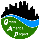 distant” left, flowing to the closer right. Like the
space between the yin and yang, the “river” reverses itself, both dividing
and unifying the more dominant impressions of town and country. The image
was designed to allow for a second purpose -- incorporating the name of the
organizations for use in larger presentations, such as billboards, placards,
banners, and podium signs. (Principle
designer: Xiong Neng Her) distant” left, flowing to the closer right. Like the
space between the yin and yang, the “river” reverses itself, both dividing
and unifying the more dominant impressions of town and country. The image
was designed to allow for a second purpose -- incorporating the name of the
organizations for use in larger presentations, such as billboards, placards,
banners, and podium signs. (Principle
designer: Xiong Neng Her)
|
|
|
HHH International, Inc. |
|
| |
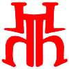 HHH International, Inc. was a start up company with it s primary focus on
China. This distinctive design represents the three “H’s” in a stylized form
that is reminiscent of a Chinese character. While it is an invented
“character,” it is similar to existing Chinese characters that have positive
images. It has a cross culture appeal. HHH International, Inc. was a start up company with it s primary focus on
China. This distinctive design represents the three “H’s” in a stylized form
that is reminiscent of a Chinese character. While it is an invented
“character,” it is similar to existing Chinese characters that have positive
images. It has a cross culture appeal.
|
|
| |
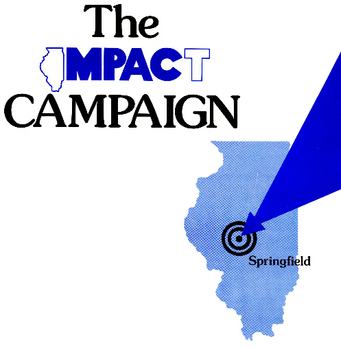
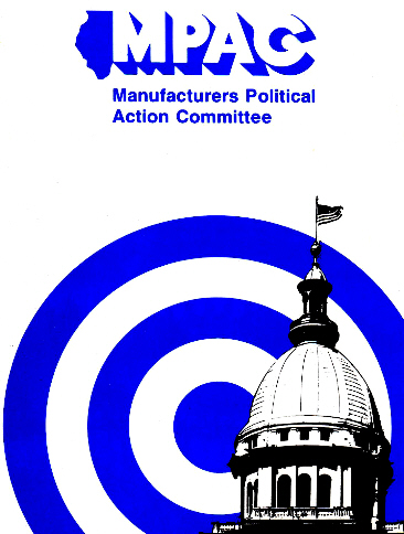
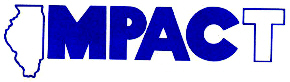
Impact |
|
| |
 These logo was created for the Illinois Manufacturers Association’s
Manufacturers Political Action Committee (MPAC). These logo was created for the Illinois Manufacturers Association’s
Manufacturers Political Action Committee (MPAC).
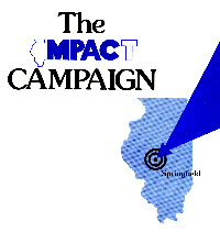 The loge retained the MPAC
anagram as the centerpiece of an expanded logo “IMPACT.” The idea was to
convey the notion that the political funds would have and “impact” on the
elections. The loge retained the MPAC
anagram as the centerpiece of an expanded logo “IMPACT.” The idea was to
convey the notion that the political funds would have and “impact” on the
elections.
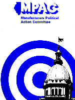 The outline of the state of Illinois symbolized the groups
state-wide reach and served as the “I” in IMPACT. The open face “T”
completed the word while retaining MPAC as an obvious element. In a
variation of the use, a target (or impact point) indicates the location of
the state capital, where MPAC contributions were to have the greatest
“impact.” The bold, unscreened colors, and all the elements of the loge were
designed to convey strength, confidence and results. The outline of the state of Illinois symbolized the groups
state-wide reach and served as the “I” in IMPACT. The open face “T”
completed the word while retaining MPAC as an obvious element. In a
variation of the use, a target (or impact point) indicates the location of
the state capital, where MPAC contributions were to have the greatest
“impact.” The bold, unscreened colors, and all the elements of the loge were
designed to convey strength, confidence and results.
|
|
| |
The
Legality of Microfilm |
|
| |
Cohasset, Inc. specialized in the storage of critical data. TJI was invited
to undertake the branding and graphic imaging of the company’s new resource
book and services regarding the legal requirement of data storage and usage.
The scales of justice reinforced the main thrust of the resource material.
The background curved “box” is actually the organizational chart symbol for
data storage – recognizable to professionals.
|
|
| |
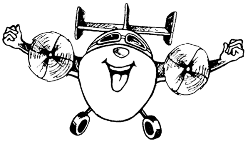
Mighty Meigs |
|
| |
 In
the original 2000 successful effort to reopen Meigs Airport, the Public
Policy Caucuses created a cartoon logo that would attract attention,
symbolize the civic effort, and convey confidence in a light hearted
fashion. Since Meigs is a small airport, a cartoon image was created to
convey strength and determination. It subtly reflected the situation as a
conflict between the noble civic community and the all-powerful of City
Hall. The Mighty Meigs logo appeared on flyers, petitions, t-shirts and
baseball caps. Posters were used in conjunction with public hearings and
legislative testimony. As planned, the logo drew attention to the cause,
and was a key element in the successful reopening of Meigs Field at that
time. (It was five years later that the Mayor of Chicago, fearing another
civic battle and potential defeat, that he illegally ordered the physical
destruction of the runway on a Sunday in the darkness of night.) In
the original 2000 successful effort to reopen Meigs Airport, the Public
Policy Caucuses created a cartoon logo that would attract attention,
symbolize the civic effort, and convey confidence in a light hearted
fashion. Since Meigs is a small airport, a cartoon image was created to
convey strength and determination. It subtly reflected the situation as a
conflict between the noble civic community and the all-powerful of City
Hall. The Mighty Meigs logo appeared on flyers, petitions, t-shirts and
baseball caps. Posters were used in conjunction with public hearings and
legislative testimony. As planned, the logo drew attention to the cause,
and was a key element in the successful reopening of Meigs Field at that
time. (It was five years later that the Mayor of Chicago, fearing another
civic battle and potential defeat, that he illegally ordered the physical
destruction of the runway on a Sunday in the darkness of night.)
|
|
| |
Saugatuck
Antique Emporium |
|
| |
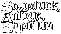 Analyzing
most antique shop signage and graphics revealed that existing type faces
were either inappropriate or a cliché. Failure to find just the right look
for a new business, TJI resorted to creating a new and unique type face.
Certainly to show traditionalism, the new style had to be serifed. The open
face style give the logo a traditional look with an airy lightness. The use
of overlapping letters created a solid oneness to the overall design – yet
the letter are easily readable. This was critical because the logo was to be
used on billboard signs and small price tags. Students of calligraphy will
not the doff of the cap to a Gothic style, but still unique enough to defy
total attribution. Analyzing
most antique shop signage and graphics revealed that existing type faces
were either inappropriate or a cliché. Failure to find just the right look
for a new business, TJI resorted to creating a new and unique type face.
Certainly to show traditionalism, the new style had to be serifed. The open
face style give the logo a traditional look with an airy lightness. The use
of overlapping letters created a solid oneness to the overall design – yet
the letter are easily readable. This was critical because the logo was to be
used on billboard signs and small price tags. Students of calligraphy will
not the doff of the cap to a Gothic style, but still unique enough to defy
total attribution.
|
|
| |
The
Suburban Republican |
|
| |
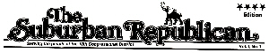 TJI pioneered the use of a newspaper format as a means of getting away from
traditional political literature. The concept was to allow for more material
to be presented to voters in an easy-to-read fashion. The graphic treatment
was to look as much like a community newspaper, but still convey the
political informational purpose. It has to walk the careful line between
looking interesting enough to read as a publication and appearing to attempt
to deceive the public into believing it was an actual newspaper. The name
“The Suburban Republican” was a simple means of indicating that the race was
a Republican effort in the suburbs. The name of the paper was to serve as a
“To” at the top of a memorandum. It was prepared for suburban Republicans.
The use of a serif typeface was used to convey traditionalism, but the open
face made if more friendly. The party affiliation was further underscored by
the use of an elephant. The particular image was intentionally selected to
represent the GOP but not be the commonly used Republican icon images. This
kept the balance between campaign literature and real news. The newspaper
format enabled the campaign to present various features in one publication –
including an endorsement editorial. TJI pioneered the use of a newspaper format as a means of getting away from
traditional political literature. The concept was to allow for more material
to be presented to voters in an easy-to-read fashion. The graphic treatment
was to look as much like a community newspaper, but still convey the
political informational purpose. It has to walk the careful line between
looking interesting enough to read as a publication and appearing to attempt
to deceive the public into believing it was an actual newspaper. The name
“The Suburban Republican” was a simple means of indicating that the race was
a Republican effort in the suburbs. The name of the paper was to serve as a
“To” at the top of a memorandum. It was prepared for suburban Republicans.
The use of a serif typeface was used to convey traditionalism, but the open
face made if more friendly. The party affiliation was further underscored by
the use of an elephant. The particular image was intentionally selected to
represent the GOP but not be the commonly used Republican icon images. This
kept the balance between campaign literature and real news. The newspaper
format enabled the campaign to present various features in one publication –
including an endorsement editorial.
|
|
| |
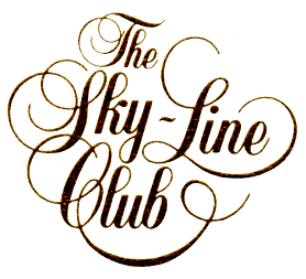
Sky-Line Club of Chicago |
|
| |
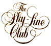 In creating a totally new logo for the prestigious Sky-Line Club of Chicago,
TJI employed a script font, but embellished it with a series of natural
flourishes that intersected and intermingled to create a subtle and unique
“medallion” effect. In creating a totally new logo for the prestigious Sky-Line Club of Chicago,
TJI employed a script font, but embellished it with a series of natural
flourishes that intersected and intermingled to create a subtle and unique
“medallion” effect.
|
|
| |
Tammany Toad |
|
| |
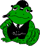 The
Tammany Toad Award (click here to view) was named after the infamous New
York political machine that was known as “Tammany Hall." The name, now
synonymous with political hackery and corruption, alludes to the meeting
place of the old political machine’s hierarchy and cronies. The Award is
presented periodically by the Public Policy Caucuses in order to draw
attention to public officials who subvert democratic principles, and whose
actions place partisanship and personal political power ahead of the best
interests of the taxpaying public. The
Tammany Toad Award (click here to view) was named after the infamous New
York political machine that was known as “Tammany Hall." The name, now
synonymous with political hackery and corruption, alludes to the meeting
place of the old political machine’s hierarchy and cronies. The Award is
presented periodically by the Public Policy Caucuses in order to draw
attention to public officials who subvert democratic principles, and whose
actions place partisanship and personal political power ahead of the best
interests of the taxpaying public.
The humanized Tammany Toad logo, with it
bowler hat, vest, watch chain, cigar and pinky ring, evokes the image of the
“ward heeler” popularized in the 19th Century cartoons of Thomas Nast. The
toad, itself, refers the negative connotation of the expression “old toad”
as a mild rebuke. The background imagery of the Award certificate adds
another reference to old style corrupt politics with the photo image of
Hinky Dink McKenna, a historic Chicago political figure who personified vice
and corruption. McKenna’s partner in “crime,” Bathhouse John Coughlin is
seated to the right, but cannot be seen since Tammany Toad is sitting on his
face, an graphic consequence that is all too fitting.
The Tammany Toad image was created by, in is
the intellectual property of, Thomas and Joyce, Inc. The use of the image
and concept has been granted to various organizations in the past. It is
currently granted exclusively to the Public Policy Caucuses, a
citizen-based, public interest advocacy group.
If you have nominations for the Tammany
Toad Award, please send them along. There is not special nomination process,
nor panes of distinguished judges. If we think you have a winner, they we be
presented the Award, and you may take public credit or request anonymity for
your submission.
|
|
| |
The Tobacco Institute |
|
| |
 Using more of a minimalist approach, this
logo for the tobacco industry civic programs intentionally moves away from
anachronistic traditional imagery. It is intended to shift the impression
from an old “dusty” industry to something sleek and more contemporary. The
beauty and effectiveness of this logo is its stark simplicity. It conveys
the tobacco image in a severe stylized presentation. Using more of a minimalist approach, this
logo for the tobacco industry civic programs intentionally moves away from
anachronistic traditional imagery. It is intended to shift the impression
from an old “dusty” industry to something sleek and more contemporary. The
beauty and effectiveness of this logo is its stark simplicity. It conveys
the tobacco image in a severe stylized presentation.
To get away from the ubiquitous “boring”
dinner program, the TJI team created a new concept. Each annual dinner
program featured a stylized image of the Guest of Honor, with little or no
copy. Not only was the cover distinctive in its own right, but placed at
each seat, the provided a much more appealing room environment than the
traditional printed programs.
|
|
| |
|
|
|
|


